Showing posts with label cuttlebug. Show all posts
Wedding season is upon us.  

Here is a simple wedding card I made by die cutting letters from silver cardstock.  The heart rhinestone ribbon buckle had been sitting in my stash for awhile so I was excited to put it to use.  You can't really tell in the picture, but the card base is navy.  I am really liking mint and navy right now.


I have decided I like to keep wedding cards simple.  Do you like them simple or more elaborate?

Thanks for looking!

Paper: PTI - Enchanted EVening, Paper Studio - silver, Lifestyle Crafts - white letterpress cardstock
Dies: PTI - Block Alphabet and Linen Cover Plate
Embellishments: PTI - Aqua Mist satin ribbon, Paper Studio - rhinestone ribbon buckle

I was busy earlier this month making the keepsake shadow boxes my church gives to families who have their children dedicated.  I personalize each one, which takes some time, but it is totally worth it.

I took last names and the church name out to post them.


Each letter in the name is cut three times in white cardstock and glued together. Next, the patterned paper I chose is cut and glued to the now thick letter and popped up with foam tape.

The name and date tags are die cut on the girls' ones using Papertrey's Christmas Label die and on the boys' using Spellbinders Ribbon Labels.  At the bottom the white verse card is cut from Spellbinders Large Labels, the logo hand colored with a coordinating Copic, and the lamb is pieced together from Cricut's Create a Critter. Before piecing I run the white parts through a swirl embossing folder to get the texture.  After the lamb is complete, I use Glossy Accents on all exposed black parts for shine and dimension.

 This green and white ribbon is some May Arts ribbon I have been hoarding.  I finally used it here as I thought it went nicely with the paper on 'Claire.'  Use your nice stuff for the people you love--I have been living by this while making the shadow boxes and my cards lately and am liking the results.  I highly suggest it.
For the boys' shadow boxes this round, I used metal tape in copper to 'hang' the letters.  I just got it last month and am loving it! Such a cool, masculine textural element.


Yes, some of the dates are different.   Parents are asking for boxes for their children that were dedicated before we implemented these boxes.  I happily oblige.

Thanks for looking!


During the February Papertrey Ink release count down I was oohed by a card made by Cristina Kowalczyk (full post here).  

At the time I did not own the circle cover plate, but it found it's way into my cart. ;)

I set out to make a card using the elements Cristina used: circle plate, ombre, and tag at the top.
Inside got some stamping love and a library pocket for the gift.  

Had I not seen Cristina's card, I still would not have the circle cover plate.  I had to pay homage to the card that inspired me so. 

Thanks for looking!
Paper: PTI - Kraft, Soft Stone, Royal Velvet, Plum Pudding, Winter Wisteria, Lavender Moon
Stamps: PTI - Stylish Sentiments: Birthday
Ink: PTI- Royal Velvet
Die: PTI - Cover Plate: Circles
Other: Library pocket, Cuttlebug


For my daughter's first birthday we went with a cupcake theme.  In the hospital for her birth, my husband nicknamed her CupKate and it stuck.
I began the idea of a cupcake invitation with these die cuts that I first stamped with the coordinating frame and then with the cupcake image.  Thinking ahead I stamped extras just incase some didn't turn out right.
I colored the cupcake wrapper with Copics and used hot pink slick puff paint for the frosting detail.  After the paint was thoroughly dry, I applied purple glitter glue for the sweet star. When they were ready, I realized I had forty-eight cupcakes that were usable--way more than I needed.
This is the invite.  The aqua is glitter cardstock and it is a pain to adhere things to, but I really the sparkle it adds.  I used a ridiculous amount of Scor-tape on these to get the ribbon and Mat Stack to stick.
The inside had the party info and a cute little coordinating cupcake which I embossed with aqua embossing powder.
I was pleased with how the icing turned out.  It had a great subtle bumpy texture as if it was hand frosted. :) It dried much quicker than I thought it would so that was a bonus too.

With the extra cupcakes, I whipped up these thank you cards.  I used letterpress paper so it took the embossing folder nicely.  
I still had extra ribbon so I made these drink labels for the party.

And yes, we served cupcakes. :)
Paper: PTI - Raspberry Fizz, Plum Pudding, Stamper's Select White; The Paper Studio - aqua glitter cardstock; Lifestyles - white letterpress paper
Stamps: PTI - Tremendous Treats: Birthday & Tiny Treats: Birthday
Ink: Memento - Tuxedo Black, PTI - Raspberry Fizz
Dies: PTI -Mat Stack #5 & Modern Alphabet, Spellbinders - Labels 4
Embellishments: Tulip - pink Slick Puff Paint; Bo Bunny - striped ribbon; purple Stickles; Cuttlebug - thank you embossing folder; Fiskars - corner rounder
This week's Make It Monday Challenge over at Papertrey Ink is glitter detailing.  Hold the phone! Glitter?! YES!
Now you must know I have a love/hate relationship with the sparkly stuff; if I am near it I get it in my eyes & hair, on my face & children, and sometimes even on my husband. I have learned that Stickles glitter glue works better for me than the loose kind. 
I used the Canvas & Linen impression plate on New Leaf cardstock and then embossed it with a Sizzix folder, sewed the perimeter, and added glitter with gold Stickles.  
I embossed the sentiment, added a strip of Scor-tape to help me pleat the ribbon, and attach it quickly. 
The die cut & stamped poinsettia got some foam adhesive for dimension and it also helped it sit better on the pleated ribbon.  I applied clear Distressed Stickles all over the green center and dotted gold Stickles on top. 
The inside got some stamping love with off-the-edge poinsettias.  I used another sentiment from Christmas Poinsettia set on the inside, which I placed in the Fillable Frames #4 image--it fit nicely too! 
Thanks for looking! 
Paper: PTI - New Leaf & Stampers' Select; Staples - white cardstock; The Paper Studio - red
Stamps: PTI - Christmas Poinsettias & Fillable Frames #4
Ink: PTI - New Leaf & Pure Poppy; Versamark - Watermark
Dies: PTI - Christmas Poinsettias
Embellishments: Ribbon Boutique - red satin ribbon; Filagree - gold embossing powder; PTI - Canvas & Linen IP; Sizzix - diamond embossing folder; Stickles - Gold; Distress Stickles - Clear Rock Candy; white thread


Taking a small break from all the feminine cards with this masculine thank you card.  Simple but interesting with the chevron.  

The nice thing is it came together quite quickly as I already had the green chevron strips die cut.  

One day a few months ago, I felt like die cutting things so I cut several chevron strips from a rainbow of colors. I keep them in a little drawer and they have come in handy a few times now! 

I glued these green chevrons down with Zig Two-Way Glue Pen but I think next time I use some of these chevron strips I am going to run them through my Xyron sticker maker.  It will make this even easier. I might just do that today!

Thanks for taking a look. :)

All items are Papertrey Ink.
Paper: New Leaf & Enchanted Evening
Stamps: Think Big Favorites #4
Ink: Fresh Snow
Dies: Chevron Stripes

Mmm...texture.  It's my favorite!  This card has some fun textures with the embossed vine background, pleated ribbon, embossed edge on the Spellbinder mat, pointed petals on the flower, and smooth button.  

It is hard to see in the picture but the flower has text stamped on it.
This medium pink, aqua, orange, and cream color combination is pretty cheerful. 

How do you mail cards with thick layers like this one?  The orange mat is raised with dimensional foam and so is the flower that also has a thick button.  I'm thinking in a bubble envelope.  How would you send a thick card?

Thanks for looking!

Paper: PTI - Berry Sorbet & Aqua Mist, Close to My Heart - orange polkadot
Stamps: Think Big Favorites #3
Ink: PTI - Berry Sorbet & Smokey Shadow
Embellishments: cream seam binding, PTI button - Aqua Mist, PTI - beautiful blooms II #1, Spellbinders - labels 4, Cuttlebug - vine embossing folder
Other: Cuttlebug

I have been wondering how I was going to utilize this squiggly lines paper so when I was browsing my pattern paper stash during my WOF card series marathon, I grabbed it.  I had a feeling this particular polkadot paper may work so I found it and was delighted that it went together; combing different companies' stuff is fun for me. 

I had received a sweet gift of Close to My Heart patterned paper and stamps a few months back but was hoarding them as they were too pretty to use.  Enter my new resolution to use the things I hoard because I love so much.  The pack contains several polkadot papers in many colors.

The flowers got some bling and slightly distressed edges to finish them off.

Next, I added some torn aqua cardstock and ran with it.  I don't use lavender paper often but was excited that it went with the squiggle paper so I used it as my base.

The sentiment is from a Stampabilities set and was stamped in dark gray.

That's it for today.  Thanks for stopping in.

Paper: My Mind's Eye - squiggles, Close to My Heart - pink polkadot, PTI - Aqua Mist & Lavender Moon
Stamps: Stampabilities - faith set
Ink: PTI - Smokey Shadow
Embellishments: PTI - beautiful blooms II #1, The Paper Studio - rhinestone brads
Other: Cuttlebug, Crop-o-dile

This is the first of a series of different cards I made for my church's Women of Faith (WOF) event.  I believe I made 70+ in a week and a half.  This is quite a feat as I have three small children and a life that refuses to pause--imagine that. ;)  Being the overachiever that I can be sometimes, I strived to make each card different.  I must say that this quality quickly becomes my own enemy many a time.  Those who know me know exactly what I mean!

For this card I used a polkadot embossing folder on some Raspberry Fizz cardstock, stamped on a Mat Stack #4 die cut, and add some colorful Bo Bunny ribbon.

All items are Papertrey Ink unless noted.
Paper: Aqua Mist, Raspberry Fizz, Rustic Cream
Stamps: Think Big Favorites #3
Ink: Orange Zest
Embellishments: Bo Bunny ribbon
Other: Cuttlebug, Cuttlebug - polkadot embossing folder, Mat Stack #4
August was a crazy, crazy month.  Not only was it crazy but it flew by--I cannot believe it has been over a full month since I last posted.  I'm sure many of you share this crazy time at August.  I created a lot but it was mainly developing my own curriculum for my son's pre-K that I am attempting to homeschool.  With that behind me, I can finally sit down and share the cards I did manage to squeeze in here and there.

This to-go coffee cup die/stamp set has been sitting, waiting for me to use it for a couple months.  I bought them specifically for whom I made this card.  It is a fun set to use.

The sentiment is stamped inside the negative cut out of the polka dot paper on the card base and edges of the polka dot paper got inked with chai ink.  
After die cutting the to-go cups, I use Tim Holtz Distress Ink on the white card stock and then rubbed chamomile ink on top of that to achieve this look.  After all that was dry, I stamped the images. I used a green and a pink Copic markers to fill color on the cups.  The loopy lines got traced with RV25 after the green was stamped, YG13 filled in the checkers on the the middle cup, and RV25 filled the hearts in on the last one. They were then mounted with foam dimensionals on top of the kraft colored ribbon that I tried to make look like steam coming up off hot cups.  I know it is a bit of a stretch but a cute stretch.  ;)

Thanks for looking!

Paper: Close to Your Heart - Dotty for You pack - pink on pink tiny polka dots, Papertrey Ink - Kraft and Stamper's Select White
Stamps: PTI - Heart-2-Heart #1 & Signature Greetings
Ink: PTI - Smokey Shadow, Hibiscus Burst, Simply Chartreuse, Camomile & Chai Distress cubes; Tim Holtz Distress Ink - Antique Linen
Embellishments: PTI - Kraft saddle stitch ribbon
Other: PTI - Heart-2-Heart #1 die & Happy Day die, Copic - YG13 & RV25, Cuttlebug

Here is the first card I am sharing that I made at the July craft retreat I attended.   The colors are cheerful and the textures are nice.  The cream is a water color paper with a great textured tooth. I like how the harlequin stamp looks distressed stamped on it.  I like the torn edges in contrast to the crisp, straight lines of the cream and aqua. I just like torn edges in general.
In hindsight I wish I would have made the flower removable so it could be a magnet or a pin.  It is a little embarrassing how long it took me to sew together those four felt flowers folded into quarters.  I tell you this because I was working on my first cup of coffee while I was sewing it and by the time I got my second cup of coffee I was a crafting bee zipping through the rest of this flower, finishing the card, and moving on to several others.  It took me forever to sew 2.5 petals together!  Lesson learned: I should finish drinking my coffee before crafting. ;)
Thanks for stopping in! Have a fab weekend!
Paper: PTI - Hawaiian Shores and Simply Chartreuse, water color paper
Stamps: PTI - Think Big Favorites #12, Jenny Bolin - Harlequin
Ink: PTI - Simply Chartreuse and Hibiscus Burst
Embellishments: PTI - Hibiscus Burst felt, Vintage Cream and Hawaiian Shores buttons, Beautiful Blooms II #1
Other: cuttlebug
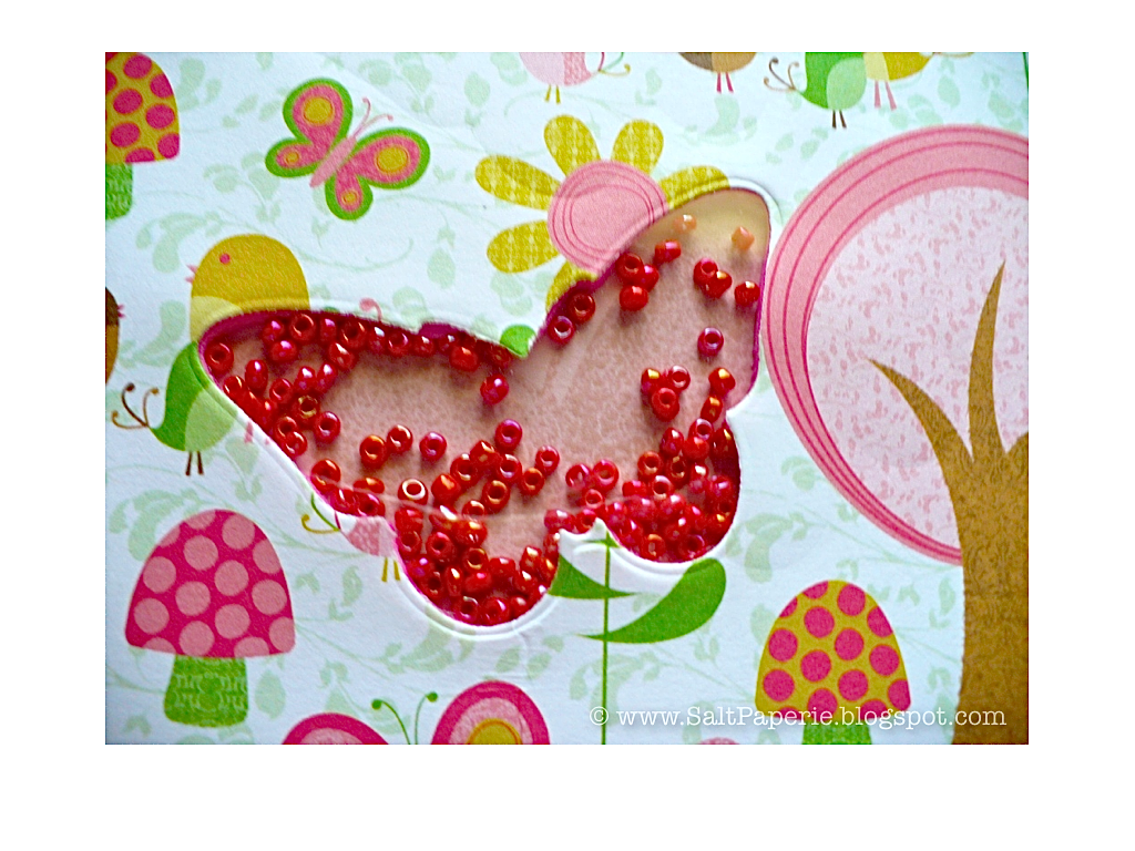
A shaker card for a girl was a new territory for me.  Out came my sticker maker, die cutter, and off to work I went.  This was the result.  I cut the butterfly in the paper and a fun foam sheet which I adhered together with my Xyron sticker maker.  It makes this soooo easy!  I layered an acetate sheet between the paper and the fun foam and put the peachy-pink back on after I stamped it with a subtle butterfly that coordinates with the die.  
A bit more adhesive and then attached it to a card base.  Mounted the sentiment strip and it was complete.  I really like these micro jewelry beads for the shakers since they work so well and have a nice noise when you shake it.


Thanks for looking.


Paper: DCWV - The Stack 6 - whimsical outdoors and dots, PTI - Sweet Blush
Ink: PTI - Hibiscus Burst and Sweet Blush
Stamps: PTI - Pretty Peonies Anniversary Set
Other: Pretty Peonies Anniversary Set die (butterfly), Xyron 5", Cuttlebug
I joined the banner trend bandwagon with this card and I must say I like banners on cards.  


The banners were just a strip of a party confetti print paper that snipped into five pieces and cut the V shape into.  To thread my floss through, I pulled out my Big Bite to make small holes on the top.  I only attached it behind my cardstock base so you move the banners and it flaps around when you move it.  


I pulled my Spellbinders ovals out to stamp the sentiment on; they have proven to be a valuable investment in my paper crafting time and again!  


Paper: PTI - Blueberry Sky, Canyon Clay; The Paper Studio - Birthday Extravaganza stack - path confetti
Ink: PTI - Dark Chocolate
Stamps: Movers & Shakers
Embellishments: Lime green floss, Cuttlebug - circles embossing folder, Spellbinders - Ovals
Other: Cuttlebug, Crop-a-dile Big Bite
I just realized I hadn't posted a card for Father's Day (or Mother's Day but that is another post).  
Tada! Better late than never, right? :) 


I grabbed this patterned paper at my local craft house because I knew it would be great for masculine cards.  For texture I ran brown card stock through my paper crimper.  I chose to put the Father's Day sentiment on a curvy die cut to echo the curves in the paper.  I sure wish dies for the On the Links set would come out...


Paper: Webster's Pages - Tennis Anyone?, The Paper Studio - brown, PTI - Vintage Cream and Enchanted Evening
Stamps: PTI - On the Links and Happy Day
Ink: PTI - Enchanted Evening, Pure Poppy, and Simply Chartreuse
Embellishments: PTI - Happy Day die, Marvy Uchida - paper crimper
Other: Cuttlebug, craft knife
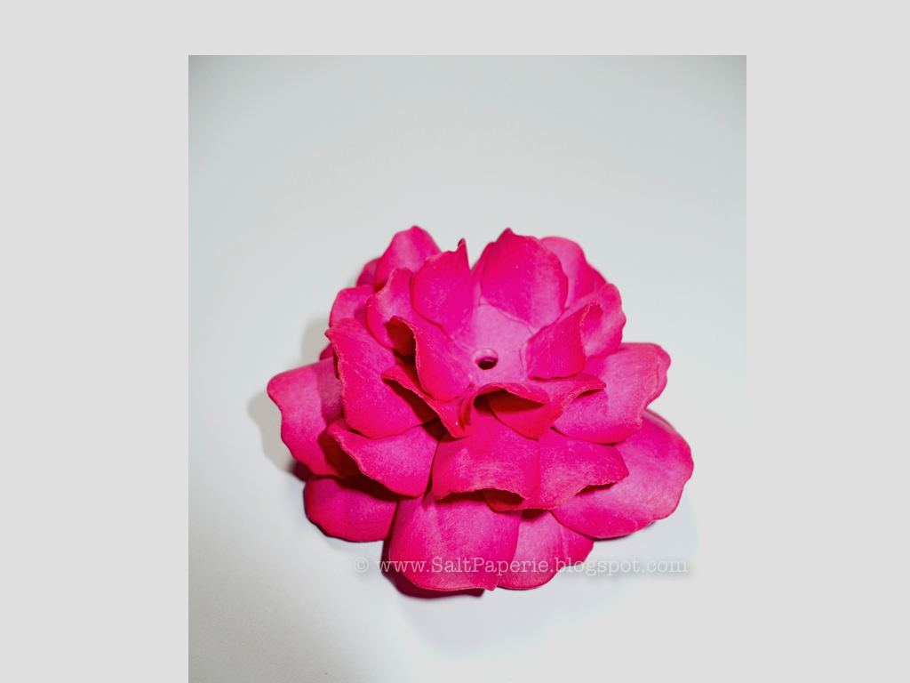
A few months ago I came across this great video tutorial on Youtube on how to use the Rose Creations dies by Spellbinders to make fabulous paper roses.  Not only does the lady who made video go step by step, but the results were easy (but a bit time consuming) to recreate.  My husband insisted that I take pictures to show the process as he too was amazed.  The video shows this all in much greater detail.  I highly recommend watching it as I am sure there are gaps in my explanation and at least for me seeing it being done really helps.
First, I cut two flowers from four different sizes from PTI Raspberry Fizz cardstock--this cardstock takes this technique beautifully.  Quickly dab the edges of the petals with ink.  The lady from the video suggests Versamark watermark which works well.  Next, using a bone folder, you curl each side of the pedals creating a V except for your two smallest pieces.
The smallest pieces you 'cup.'  She uses a nifty ball bearing tool but I don't have one so I used one of my Cricut tools that has a rounded metal back and pressed it in a circular motion quite hard on top of a piece of fun foam.  My cupped flowers are not as tight as hers but they worked.
Glue what ever you wish in the center of one of the smallest flowers and when dry, glue a small part of the edge of a petal to the one next to it all the way around the flower.  I found that Zip Dry glue works really well for this.  It gets rubbery and elastic when dry (and dries fast) and you can position the petals pretty realistically wit the give. 
Next, glue each of the same sized petals together.  Be sure to stagger the petals for a realistic look.  These are the largest flowers glued together here, which will be the base.
The next size set of flowers get glued together and then glued to the base.
By the time you go to glue the third set of flowers, you'll need to position them into the petal crowded area.  I found that holding them down by pinching the top to the base with my thumb and index finger helped while they dried.

Glue the cupped flowers in the middle.  You may need to fuss with the petals a bit to get the look you want.
That is it. A little work and you can create these pretty paper roses.
I just realized I hadn't posted a card for Mother's Day (and Father's Day). 
How could I not post this beauty?! Well, if you must know, I usually give the cards away before I take pictures of them for my blog. That was the case here.
I am in love with paper roses.  I made this one with some Spellbinders dies (tutorial to come). In person they look they are made out of ceramic.  I mounted it on a Spellbinders oval and then colored the edge with my BG11 Copic marker.
The lace is a stamp, which I used on the front and the inside.  There is a strip of satin ribbon at the top and two tiny pearls on either side of the filagree oval frame, but their height goes unnoticed because of the massive flower on the front--they just add a little pretty shimmer to pull the inside together.  I had to edit out my writing--my mom was nice enough to give it back for me to photograph.  She knows my house turns into a twilight zone for other people's things--they take for-e-ver to get back to people once they have entered. 
I had to make a box to put this card in as the rose rises almost an inch off the paper.  To go with the rose theme, I stamped roses in Autumn Rose and then scored the cardstock to make a box.  
You don't expect to get a card when you open a box.  :)


Paper: PTI - Autumn Rose, Aqua Mist, and Sweet Blush; unknown - cream; Staples - white 
Stamps: Kaiser Craft - lace, PTI - Pretty Peonies and Year of Flowers Collection
Ink: Versamark - watermark, PTI - Aqua Mist, Autumn Rose
Embellishments: The Paper Studio - pearls, PTI - Aqua Mist Satin ribbon, Spellbinders - Ovals and Rose Creations, Filagree - gold embossing powder, Cuttlebug - floral embossing folder
Other: foam dimensional adhesive, Cuttlebug, Martha Stewart Crafts- Scoreboard
I am really liking my On the Links golf themed stamps.  They lend themselves easily to masculine cards, but with color changes you can make a feminine one.  Glad I purchased this!  Now that I am getting older, I have many more friends taking up golf.  


The three lighter golf bags were stamped with watermark ink, which made that great green.  It needed some oomph so I stamped the golf balls on the edges.  Next, I ran it under the Canvas & Linen Impression Plate to give it texture.  After I stamped the navy golf bag, I cut it out quickly with a craft knife and adhered it with dimensional foam.  I feel like I achieved a bight and masculine card for this one, which totally reflects the recipient for whom I made it.


Paper: PTI - New Leaf, Staples - white, DCWV - The Guy Stack - green plaid
Ink: Versamark - watermark; PTI - Fresh Snow and Enchanted Evening
Stamps: PTI - On the Links
Other: PTI - Canvas & Linen Impression Plate, Cuttlebug, craft knife, dimensional foam
Before
After
I had this card sitting around a few months and knew it needed some umph but didn't have the time to fiddle with it.  It finally got some attention and I turned it into this cheerful little number.  I took the kraft color ribbon off and replaced it with a vibrant green--it instantly brightened it!  Next, I pulled out my Copics and colored in the stamped flowers and leaves.  To add more pizzaz, the flower centers got a little bit of lavender Stickles.  
I am pretty sure this get well card feels better too now that it got a make over!  The original photo made everything orange-y.  Blah.  My photography and photo editing skills need some attention next.  One thing at a time...
Papers: PTI - Berry Sorbet, Melon Berry, and Aqua Mist
Stamps: PTI - Stitches and Swirls, Think Big Favorites #10
Ink: PTI - Plum Pudding, Raspberry Fizz
Embellishments: PTI - Plum Pudding button, Michael's - green grosgrain, Spica glitter pen - clear, Copic - YG13, R22, RV23, Stickles - purple
Other: PTI - Beautiful Blooms II #1 dies, dimensional adhesive
Related Posts Plugin for WordPress, Blogger...